Dark Horse is rated Mature! Although a part of the "magical girl" genre, Dark Horse has nudity, swearing, sexual situations, and violence, as well as adult themes and situations. Reader discretion is advised.
Blue Dragon at the Spot Market
Hey ya'll, on December 14th I'm selling at The Spot Market at the Lloyd Center in Portland. I'll be doing live caricature chibi sketches and have copies of my comics on hand. For more details, check out my upcoming events!
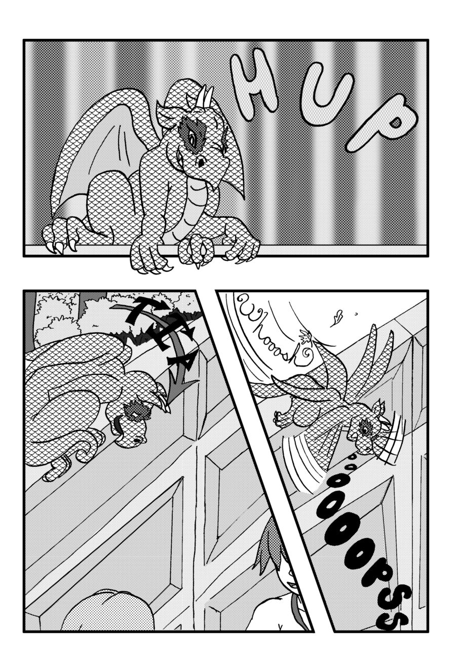
1st panel – I remain slightly confused by our dragon friend’s* clambering onto a wall, mainly due to the lack of movement lines and their relatively stable pose in the frame.
2nd panel – Onomatopoeia was slightly hard to read due to low-contrast text. Also would have liked to see movement lines following Dragonfriend’s downward movements.
3rd panel – The sudden breeze in the upper left came off as abruptly introduced to me. It might have helped if, say, the trees and grass were swaying occasionally from the wind in the other panels, or if there were a transition panel where the wind suddenly picks up.
*I know who they are, but I won’t mention them by name until their formal introduction to avoid spoilers for first-time readers.
COMMENTARY:
Dragonfriend’s scales look weirdly static in motion. (There’s a trope for that: Unmoving Plaid.) On the other hand, hand-drawing textures and shading based on angles can be a pain in the arse, and I’ve seen plenty of Unmoving Plaid textures in manga as well.
Good points, all of these. I do struggle with motion lines (and sound effects, too). I’m being mindful of them, but spot on: I need to work on it XD
Oh yeah, scales are a definite issue. Drawing individual scales is very time consuming. It’s frustrating enough doing individual feathers. I’ve tried doing just clumps of them…I lowered the opacity of the tone for a hot a second (I actually think that may be the best way, but then I realized he’s not really as dark as he should be-not that I can match tone to color that well). I tried a combo at one time and didn’t like that. I don’t have a solution XD I think I need to remember to lower the opacity of the scales and that might help with some of the stasis. What I need to do is find what works and just use that XD
Can I just say, if you are not already, you would make a great editor? You’ve got a really good eye for details. Seriously.
You give me too much credit, but thank you anyway! I’m glad my feedback has been useful so far.
Textures can be tedious, yeah! Especially if the material is fine (or supposed to be), or if there isn’t enough space for details. Or if you have to take lighting and angles into account, or draw the same textures repeatedly.
I dunno if it helps, but you could try scaling (cough) back on the scales and only drawing a few on key parts on Dragonfriend’s body, depending on the angle and pose. (Example: a short row of scales outlined on their upper arm and thigh in Panel 1, a few scattered on their back on panels 2 and 3.) This might save you time and keep the textures from clashing with the backgrounds or any shading you might add.
XD
I will have to go back to trying that method. I’ve been inking for much longer now, and 2020 was my year of focusing on ink, so I’m a bit more confident and think that’s a good plan from here on out 😀

4 Comments
FEEDBACK:
1st panel – I remain slightly confused by our dragon friend’s* clambering onto a wall, mainly due to the lack of movement lines and their relatively stable pose in the frame.
2nd panel – Onomatopoeia was slightly hard to read due to low-contrast text. Also would have liked to see movement lines following Dragonfriend’s downward movements.
3rd panel – The sudden breeze in the upper left came off as abruptly introduced to me. It might have helped if, say, the trees and grass were swaying occasionally from the wind in the other panels, or if there were a transition panel where the wind suddenly picks up.
*I know who they are, but I won’t mention them by name until their formal introduction to avoid spoilers for first-time readers.
COMMENTARY:
Dragonfriend’s scales look weirdly static in motion. (There’s a trope for that: Unmoving Plaid.) On the other hand, hand-drawing textures and shading based on angles can be a pain in the arse, and I’ve seen plenty of Unmoving Plaid textures in manga as well.
Good points, all of these. I do struggle with motion lines (and sound effects, too). I’m being mindful of them, but spot on: I need to work on it XD
Oh yeah, scales are a definite issue. Drawing individual scales is very time consuming. It’s frustrating enough doing individual feathers. I’ve tried doing just clumps of them…I lowered the opacity of the tone for a hot a second (I actually think that may be the best way, but then I realized he’s not really as dark as he should be-not that I can match tone to color that well). I tried a combo at one time and didn’t like that. I don’t have a solution XD I think I need to remember to lower the opacity of the scales and that might help with some of the stasis. What I need to do is find what works and just use that XD
Can I just say, if you are not already, you would make a great editor? You’ve got a really good eye for details. Seriously.
You give me too much credit, but thank you anyway! I’m glad my feedback has been useful so far.
Textures can be tedious, yeah! Especially if the material is fine (or supposed to be), or if there isn’t enough space for details. Or if you have to take lighting and angles into account, or draw the same textures repeatedly.
I dunno if it helps, but you could try scaling (cough) back on the scales and only drawing a few on key parts on Dragonfriend’s body, depending on the angle and pose. (Example: a short row of scales outlined on their upper arm and thigh in Panel 1, a few scattered on their back on panels 2 and 3.) This might save you time and keep the textures from clashing with the backgrounds or any shading you might add.
XD
I will have to go back to trying that method. I’ve been inking for much longer now, and 2020 was my year of focusing on ink, so I’m a bit more confident and think that’s a good plan from here on out 😀